Trend - 2019 Spotlight.
2019 Interiors trends have really pushed the boundaries this year. We take a look at the trends of Autumn Winter 19 and Spring Summer 19, we think they are the best yet.
We are so happy we chose this year to launch our debut collection as the trends for home have been so inspiring. Bold colours meet intriguing textures making 2019 full of interest and excitement.
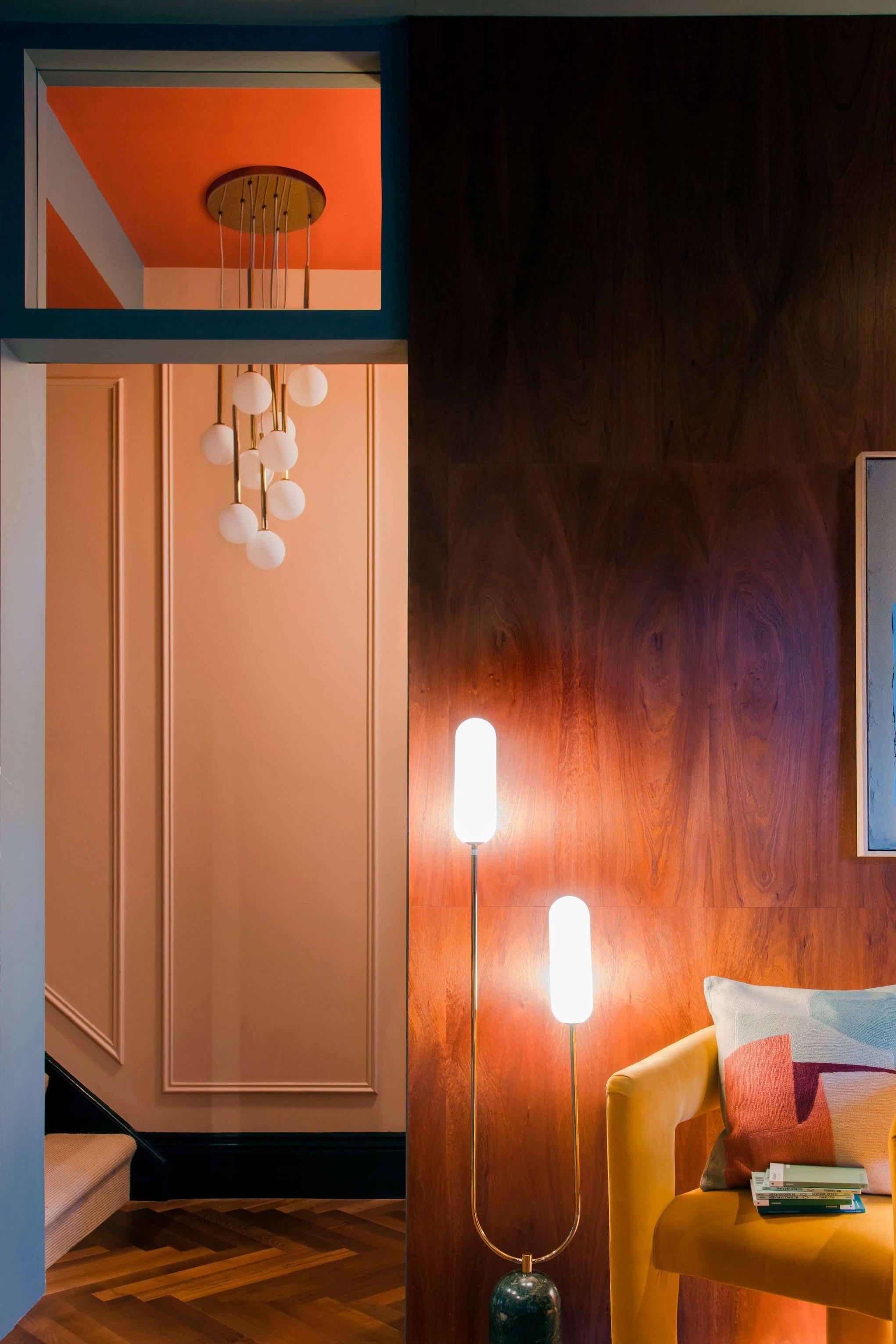
The colours this year are bold and bright and we started off our collection this spring summer with a mix of dazzling blue and living coral, which is also the pantone of the year. Our signature lighting has also been coloured up in olive green and dusky tonal pink as we believe those are the colours which are here to stay in interiors.
Here’s a highlight of the interior trends this year:
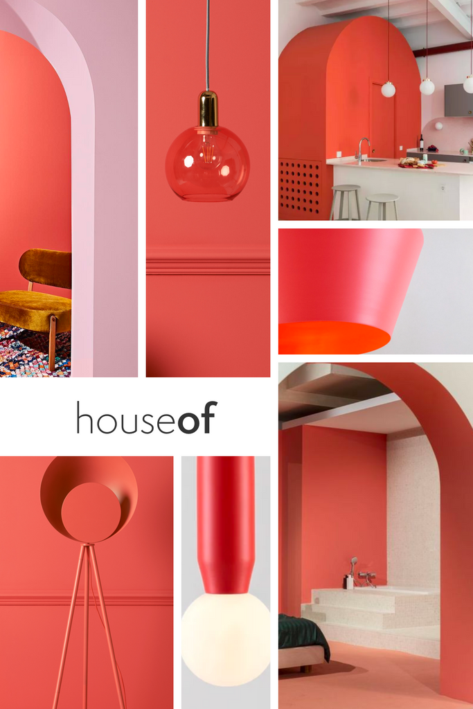
Living Coral
Pantone have listed coral as their colour of the year and they know a thing or two about colour. Living coral is brighter than the corals we have seen in seasons past and is a great colour pop to add to any interior. It’s confidence makes it the perfect choice to brighten up a white room or against a cool grey wall.
Dazzling Blue
Blue has been around for a while but this is dazzling blue and we think we are one of the first to spot this trend. Dazzling blue does what it says and takes inspiration from the crystal blue seas and rooftops of Santorini. Paired with white, it creates a modern take on coastal decoration but mixed with coral or pink and makes for a dramatic look.

The New Marbles

White and black marble has been around for a while and have become a staple in most interiors. This season we have looked further afield and sourced new pink, green and blue marbles with the most intriguing textures and veins. Layering these textures on top of block colour and even with existing marbles brings your current home interior inline with 2019.
Tone on Tone
At houseof we aren’t afraid of colour in interiors and we embrace it. We think there are so many ways to incorporate it into your house even using this chameleon technique. This is a brave interiors trend this season, but done right it can be rather striking. The chameleon technique camouflages accessories and uses texture to create interest.
Colour on Colour
Our second colour trend is all about contrasts. Looking to the interior designers colour wheel for inspiration, taking polar opposite colours and layering them on top of each other. Try coral with pink, blue with coral or even green with pink.
Nearly Black
Why is it nearly black? Well, we think our nearly black is a lot less harsh than the black we have seen in recent trends and incorporating it into your interior isn’t as harsh. Our nearly black is technically charcoal - it is slightly softer but still really moody.
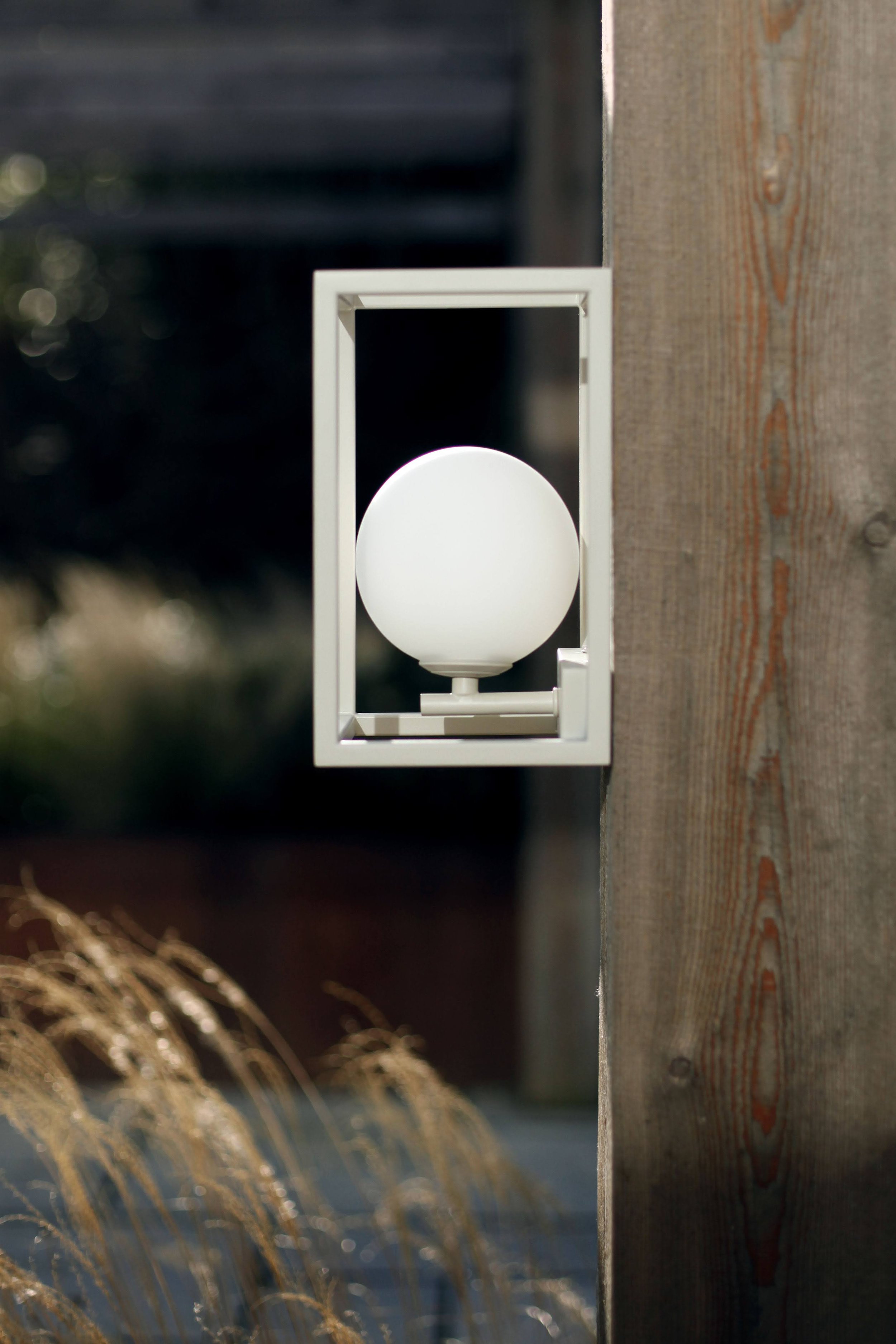
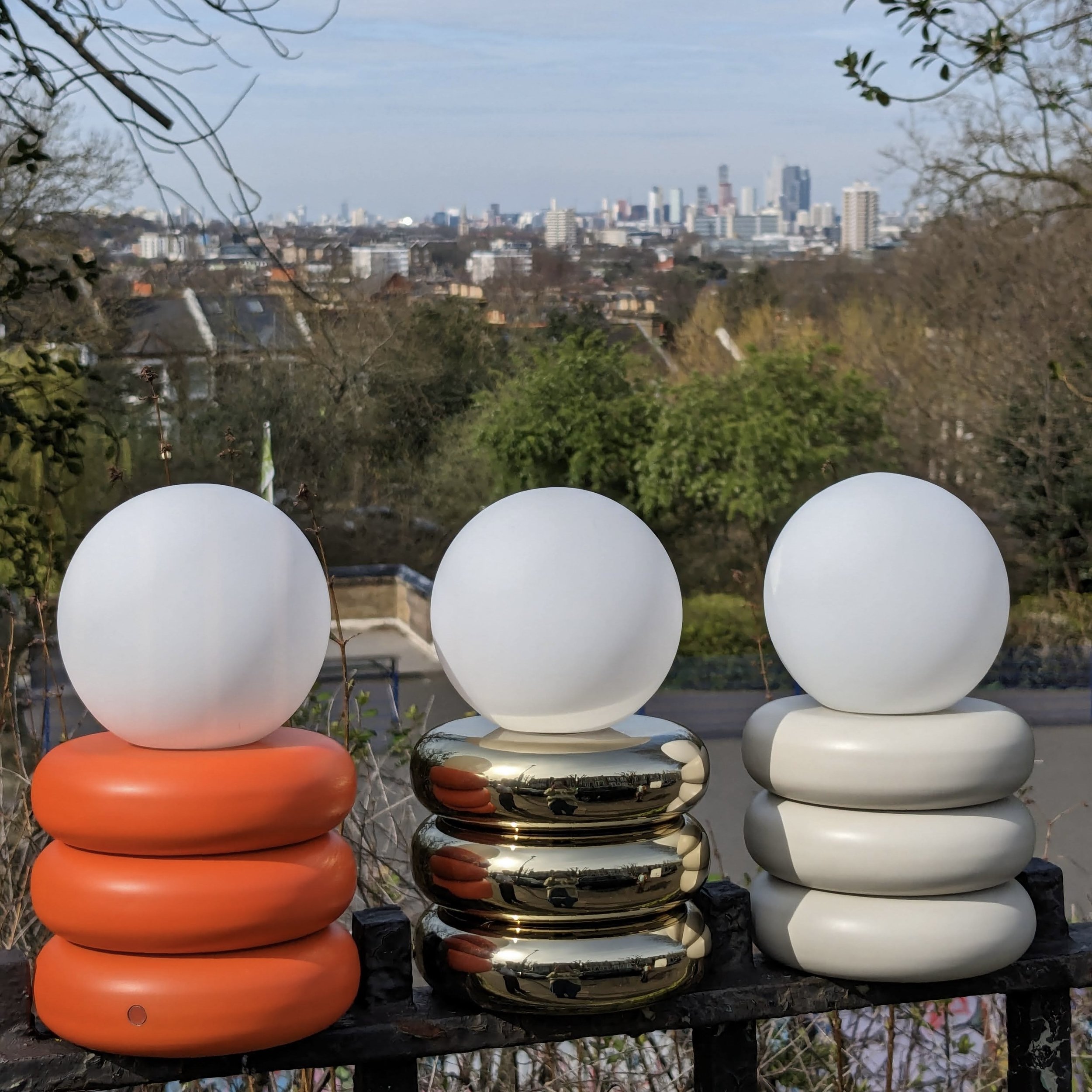
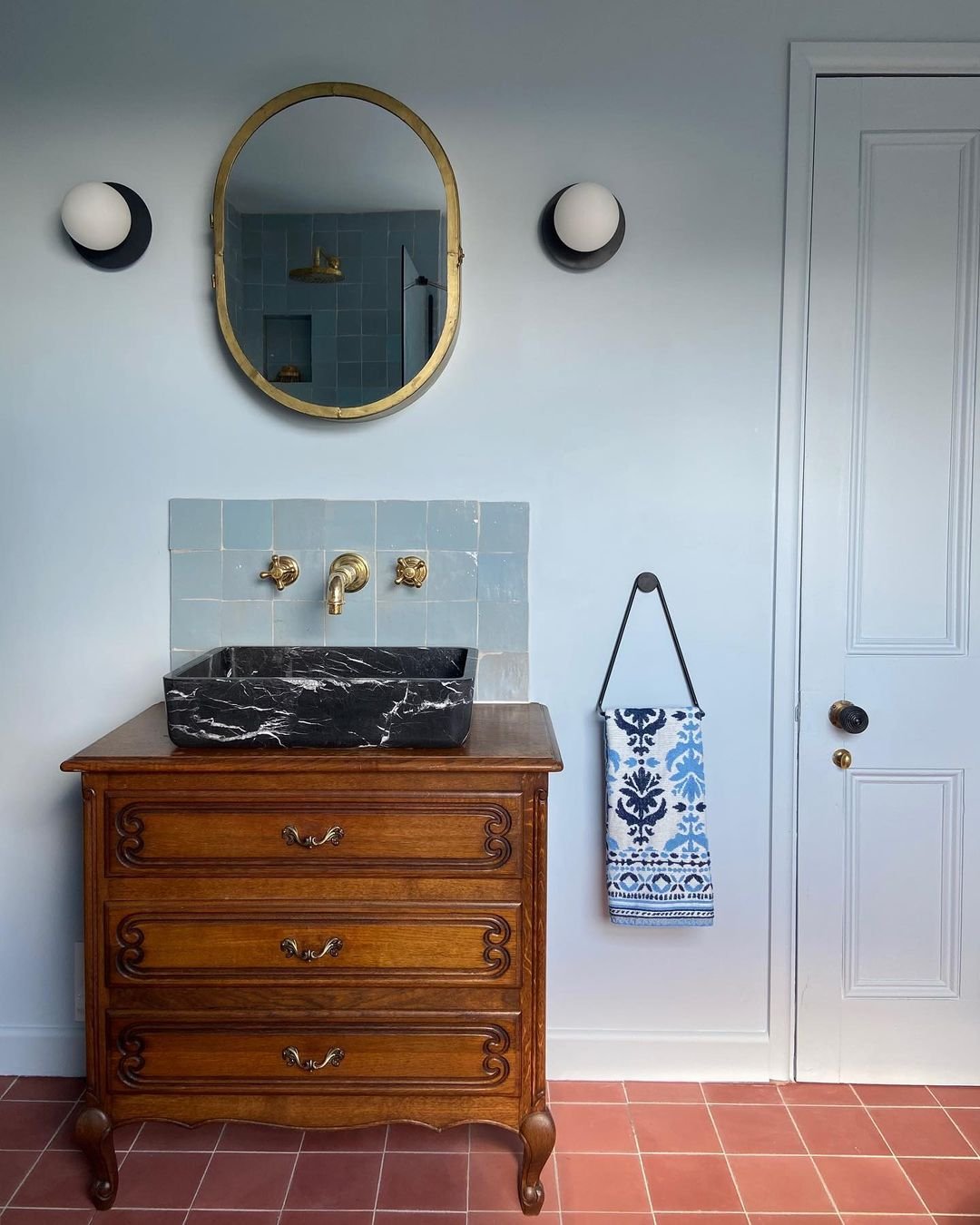
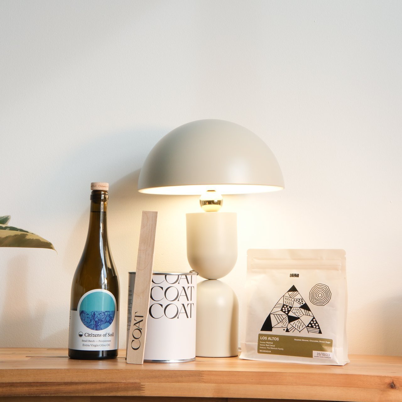
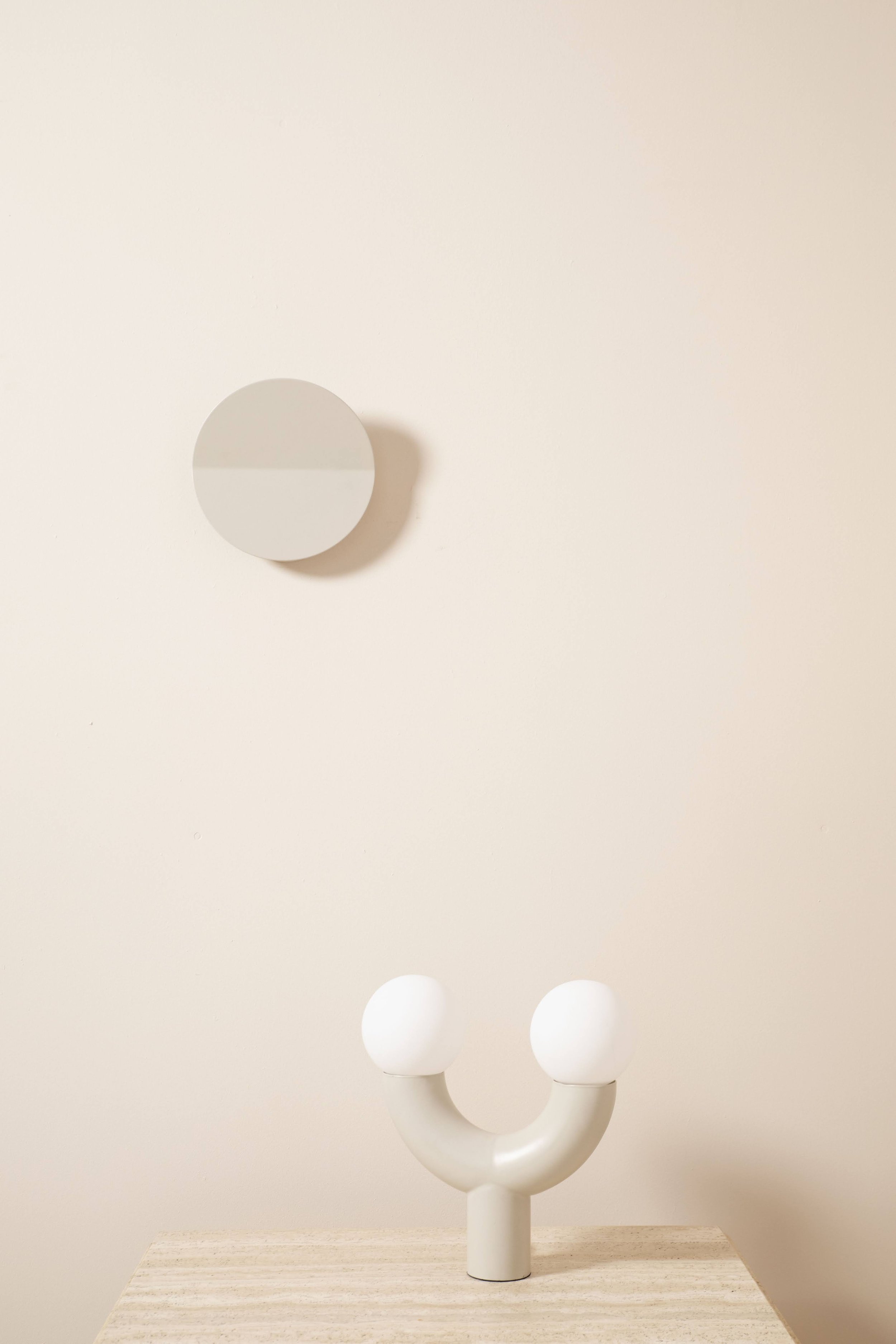
Curves
If you have missed this trend, where have you been? It is less about geometric this year and all about soft curves. Still a very graphic trend with 2 dimensional shapes but a lot softer on the eye and much more playful.
Heard enough and want to try these out in your house? Have a look at our next blog on how to incorporate our new trends.