Mood Boards: What? How? Why?
This week we invited Bristol based interior designer Nadia Reid to walk us through how she creates a design mood board. Nadia is an Inchbald graduate and lover of old houses and eccentricity - head over to @form_and_precedent on instagram to see the stunning renovation of her period home.
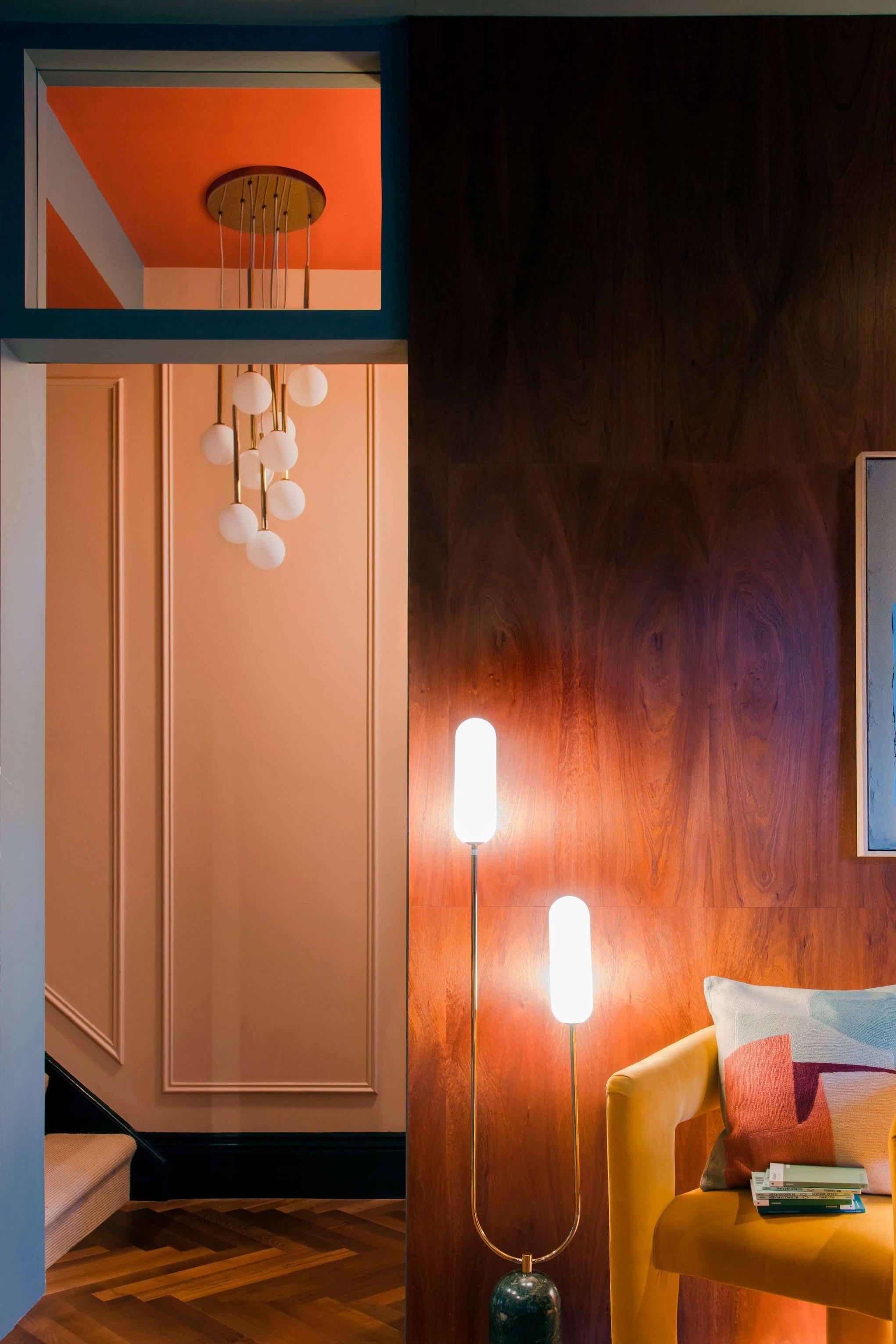
If you’re in any way interested in interiors, you’ll be familiar with mood boards in their many guises. From furniture images arranged to resemble a room set, to an array of fabrics and finishes layered on a coffee table, via collections of more abstract images from nature, mood boards are prevalent across social media and as a key component of the marketing materials for companies supplying fabrics and finishes.
Interior designers tend to differentiate between concept boards which convey a mood or emotion, without any specific reference to what the room may look like, design boards which pull together fabrics, finishes and materials to highlight the use of colour, texture and pattern, and specifications boards which focus on the nitty gritty of furnishings and fixtures. But whichever approach you take as a homeowner, mood boards serve two simple purposes: to help clarify the direction you want to take with a room and to convey that vision to someone else — mood boards, together with basic furniture plans, can help ensure you avoid costly mistakes or disappointment as well as aiding domestic harmony by ensuring everyone has the same understanding of what’s about to happen!
Whether you’re collating your mood board digitally or physically, here are a few tips to help get you started:
While digital boards can be useful for first thoughts and presenting ideas to others, always get samples for any paints, wallpapers, fabrics and finishes. Presenting these in a way that enables them to be handled and rearranged is very helpful, enabling finishes to be switched or upscaled from their initially intended use. Cheap cork notice boards and square display trays are both useful for this purpose.
Shop your house for additional finishes and textures, e.g. if you intend to use a specific metal finish, wood or stone in furnishings, see if you can find a way to reflect this in your board. Tile and flooring suppliers are a great source of samples of woods, marble etc.
Think about the scale and proportion of colours and patterns as they’ll appear in a space and reflect them accordingly in your board. If all four walls are intended to be the same paint colour, this should be a significant feature of your board (maybe even the backdrop colour); a fabric intended for curtains should be given more space than one intended for a cushion.
If working digitally, ensure you’re reflecting the scale of patterns accurately. A blousy floral has a very different impact when oversized compared to one which repeats frequently across a wall.
Consider variations in texture as well as colour and pattern. A room in which every surface is smooth can look very flat and dull. Bear in mind that very small / fine pattern on wallpaper or fabrics can read as subtle textural variation at a normal viewing distance.
Reflect the way that fabrics interact in a room within your board; overlap cushion fabrics with sofa fabric, and place curtain fabric adjacent to the wallpaper.
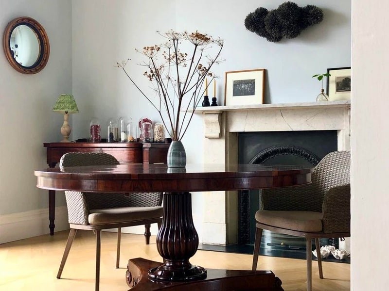
Remember to factor in the ‘fixed elements’ of a room and build around them — the red terracotta tiles that aren’t going anywhere, the period dark oak fireplace, the white uPVC windows that are going to scream out against dark painted architraves, etc. Many things can be painted or refinished, but sometimes it makes more sense to just work around them!
If you struggle with pattern, try starting with a rug or fabric that contains at least three colours and use this as your starting point, ensuring that anything you pull into the scheme shares at least one of the colours. In this small bathroom concept, I’ve combined three different and strong patterns, which work together as they link from the unifying green and blue wallpaper. A similar starting point can help with choosing co-ordinating colours, as can an investment in a decent colour wheel.
Choosing colour and combining pattern are vast subjects and there’s loads of additional advice out there, but remember that you should always review your choices in the room that they are intended for, at varying lighting levels and on the plane they are intended for, that is, looking at a fabric laid flat will not give you a clear indication of what it may look like hanging on a wall, paint that looks a certain colour when held up to a wall will look very different on a ceiling.
Finally, have fun with it! Don’t feel as though you have to create a perfect board at first attempt; the idea is to do all of your thinking and experimenting at this stage to avoid nasty surprises and problems later on.