Inspiration - Pantone® of the year.
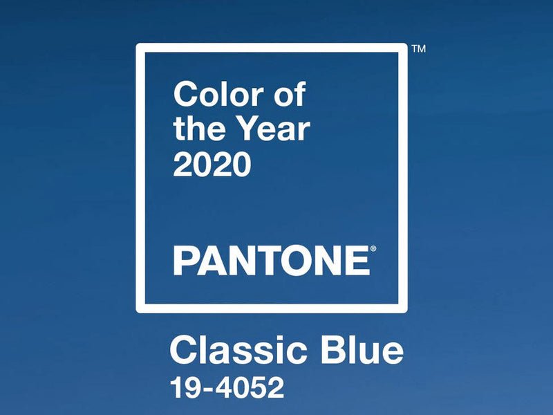
I don't know if you noticed but we have successfully predicted the Pantone® of the year for 2 years running! Classic blue is safe, dependable and aids concentration which is why in this busy year of change Pantone® have chosen it. Read on for a full overview of the Pantone® of the year 2020.

Colour is a pretty big deal at houseof and we are constantly surrounded in swatches and Pantone® books trying to get the perfect colour.
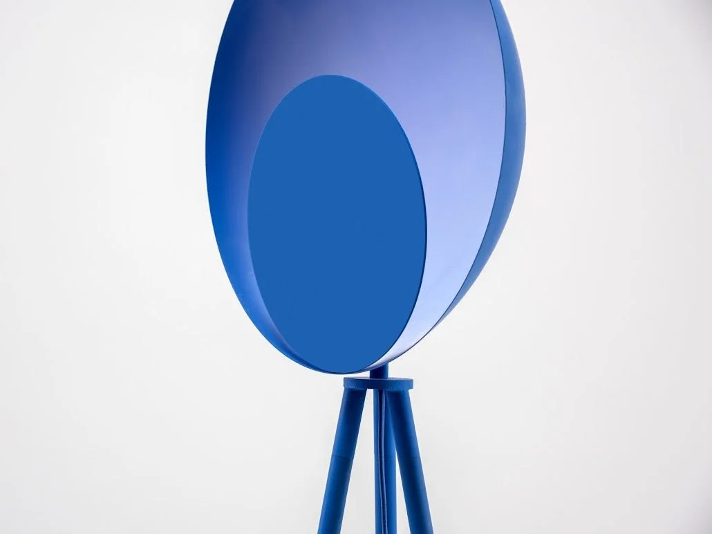
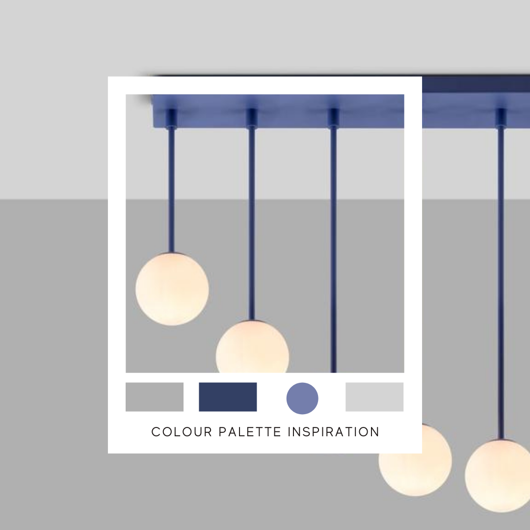
The colour of the year for Pantone® is 19-4052 Classic Blue. Blue has been ticking along in the background for a while, and started with the introduction of Farrow and Balls Hague Blue into everyone's home a couple of years ago. Since then, it has got a couple of shades brighter and full of pigment.
This blue is a perfect accent colour. Pantone® don't expect us to all grab our paintbrushes and overalls and overhaul the house (again) but just simply integrate this into an existing scheme. It actually sits very well with 2019's much loved Living Coral as well as other key colours like pink.
The psychology behind the blue is that it represents calm and dependability. In these times of uncertainty, Pantone® understands that we are all looking for stability. Classic blue is also cited as "aiding concentration" and "reflective" so a perfect shade for bigs plans in 2020.
Planning on incorporating Classic Blue into your house, read how on our blog.
Shop Pantone® of the year Classic Blue here