Houseof x YesColours
Time to show off one of our favourite, feel-good, planet-focused brands; YesColours! Colour obsessed co-founders, John and Emma, are taking the paint industry by storm by stepping away from the conventional paint tin. They’ve created Europe’s first recyclable paint pouch, tackling the paint waste issue at the start, rather than the end.
Innovative, exciting and odourless colour ways; YesColours simplify what can be quite a confusing part of the DIY process, and we are beyond impressed!

It has been such a pleasure to be introduced to your brand, a like-minded start-up like ourselves looking to refresh and revolutionise the renovation industry; and to think there are only two of you behind the brand - you’re achieving so much! We would love to hear how you created your business?
It began through a conversation John had with a family member about the leftover paint tins building up in the garage. They were discussing how difficult tins are to dispose of in an environmentally friendly way – currently, over 55 million litres of paint and 14,000 tonnes of tins go to landfills every year and only 2 per cent ever actually get recycled. It’s astonishing. So we were inspired to create a paint brand that changes the way we decorate for the better, is benefit-driven and puts purpose before profit. And also one that did things differently, unlocked people’s creativity and reignited everyone’s connection to colour. We didn’t want to be overly reliant on colour trends or the status quo in the paint sector. We now have a unique and fully recyclable paint pouch that we hope will make it really easy for people to recycle their paint waste, and a selection of colours inspired by the world around us - from different cultures, travel, film, music and even food.
John and I have been friends for over 20 years. We were both unemployed during the first UK Covid-19 lockdown and that’s when he came to me with the concept of YesColours. At first, I was more of a colour sounding board, but as the months went on, it became increasingly apparent that I was just as invested in the business as he was - that’s how our official partnership began as co-founders.
I’m also lucky to have Grapheme Colour Synesthesia, where I see particular letters and numbers in specific colours. Naturally, I am obsessed with colour and have painted and created art all my life, so I couldn’t have dreamt of a better job!
Sustainability is at the heart of your company, could you talk us through how you differ from the conventional paint brands? Are there any new ideas you’d like to implement this year that drive your environmental values further forward?
We’ve created Europe’s first recyclable paint pouch. Being hugely passionate about sustainability, we took to reinventing the customer journey, tackling the paint waste issue at the start, rather than the end, and offering paint to our customers in waste saving, fully recyclable packaging. We’ve also made sure that our paints are free of harmful chemicals with 0% Added VOCs, 0% microplastics, vegan and cruelty-free without compromising on quality, vibrancy or colour.
Our aim is to empower customers that care about the environment to help protect it - rather than putting more tins straight to landfills. We’ve kept sustainability at the heart of how we operate and will continue to do so - from our packaging to our supply chains, our use of raw materials and supporting UK manufacturers (YesColours is Made in Britain accredited).
The next step is to evolve the recyclable pouch packaging to an even more sustainable option with its contents being made up of more than 30% of recycled material, there’s a step after that too with an aim to use Green PE plastics but it takes time to get it right and we will never stop innovating.
The YesColours interactive palette is so effective; you have really simplified what can be quite a confusing part of the DIY process. What would you say are your favourite colours or collections that you have created? (Mine is definitely the loving green and calming blue!)
Oh good choices! The colour names say it all really, don’t they?
On a universal level, in my life, I would have to say green, so from our palette; the retro-loving Passionate Olive Green is a fave but also the Marrakech inspired Electric Mint Green. The Electric Blue was the first colour we developed as it’s such an energetic optimistic colour and came from my obsession with Yves Klein and the Majorelle Gardens in Marrakech. It’s been a bestseller from the start.
When it comes to one of our collections, I’m torn as I think it depends on what mood I’m in. Electric is always there to give me a buzz of energy and the Friendly, Joyful collections never fail to put a smile on my face as they remind me of so many things in my life which give me joy, including ice cream and a dream holiday to Miami one day…
It’s intriguing to see that your paint is not only used for renovations but also used in the fine art industry, it must be really flattering to see artists use your beautiful colours. Were you surprised to see this?
We shouldn’t have been surprised because we offer such a variety of colours from the colour wheel, we leave no hue excluded but it’s been such an inspiring journey to see so many painters, jewellery makers, mural artists and jesmonite crafters use our paint for a multitude of creative projects. It means a great deal to us that we not only can inspire our consumers to paint their walls in whatever colour they feel is important to them in their homes but to be able to be part of someone's artistic process is hugely touching. Colour offers us limitless possibilities and it just proves that so many of us like to experiment and want to express ourselves with colour in different ways.
“Colour offers us limitless possibilities and it just proves that so many of us like to experiment and want to express ourselves with colour in different ways.”

We love the inspirational edits section on your website, where you have lifted colour palettes from inspiring places, food, movies, etc… How do you decide on a new paint colour?
When it comes to launching new colours, it always goes back to our original plan; forget trends, they come and go, but the world around us offers us so much more. When I first came up with the initial palette, we had over 138 colours which all filtered down with visuals from relatable and cultural experiences.
We then had to boil those 138 colours down to a more succinct palette of 47 colours, so we can always go back to our archive of colours and use them in the future but our focus right now is to fill in the gaps in the current collections. We’re just about to launch a Fresh Green because our Fresh Collection has proven to be very popular and our customers are using pastels as they’ve never been used before. They are creating bolder rooms with a design-led approach, often contemporary rather than the attached stigma of frilly flowery pastel schemes. Pastels can be whatever it wants to be in the YesColours world. So we consistently look back at the feeling we want to create with colour. I hand mix hundreds of options that I feel match the tones and emotion of that specific collection and then spend countless evenings deciding on the final hue that will become part of that ‘colour family’.
Next on the list will be to add a few more colours to the Loving collection. Look out for a deep inky blue, a golden deep mustard yellow and a glorious rusty orange…
“The good thing about wall paint is that it’s an inexpensive part of a renovation so you can take risks with it and change up if you don’t like it.”

A lot of our customers are at the early stages of house renovation, we would love to hear some top tips for when it comes to giving the rooms/furniture a lick of paint.
I would always advise starting with a blank canvas. So once the walls are neutral, it’s far easier to then work out what you want from a space. Live in it first, then decide where you want to feel cosy; where you want to feel energised; relaxed…etc Your home is like a group of friends, all with different personalities and therefore will be wearing different clothes, have a different identity. Your rooms are exactly the same. They can have a different identity or they can all be similar and cohesive. It’s your home, your rules.
The good thing about wall paint is that it’s an inexpensive part of a renovation so you can take risks with it and change up if you don’t like it. If you invest in a sofa, carpet, tiles or furnishings and then fall out of love with it after a few months - it’s not so easy to change. You can experiment a lot more with paint. Don’t be afraid to try a colour you’ve never used before. You can always test with a sample first and sit with it for a few weeks or check out our interactive palette online. It’s got to feel right for you.
There’s the practical element to it too. If you need areas to be more hardwearing like a hallway and kitchen, consider the paint finish you will require. Eggshell and gloss are ideal for woodwork, doors, kitchens, bathrooms and furniture. I have 2 young girls and if I could gloss the whole house, I would - it’s super wipeable and takes the energetic knocks!
What has been your biggest achievement since creating your business?
Apart from knowing that we contribute to offering an alternative solution to changing the paint waste landscape, I would say that having the opportunity to work with local communities and improve public spaces with our colour has been something I have wanted to be part of for such a long time. The current project I cannot wait to visit is with an artist I’ve admired for years; Morag Myerscough, who has designed the Joy Pavilion for Sheffield's Children’s Hospital. We have provided all the paint for the permanent outdoor installation and we really couldn’t be prouder. The impact of colour in regeneration areas and community environments is something we will continue to advocate forevermore.
Who are your absolute favourite designers/creatives/businesses to follow on Instagram?
There are so many I love to scroll on. I love Laura Perryman @lauraemilyp who is the author of The Colour Bible. I’ve learnt so much from her, she has a Domestika course too which I highly recommend people check out.
The interior designer Bo Fentum has such a beautiful aesthetic. Her love for midcentury, the ’70s and Palm Springs makes for a fabulous insta grid. Emma Gurner from Folds Inside Ltd is also a great advocate of scandi simplicity alongside bold colourful accents and features.
And how can we not mention some homegrown Insta talent such as Jay from Paintthetownpastel - who has been such a support for us since we were a tiny seed of an idea. Her approach to pastels with her architectural background is a delight for the eyes. Every post image is delicious and her Insta stories are so funny and inspiring, full of dry wit and genius creative ideas.
For a pure indulgence of body, mind and spirit; The Color Factory in America has a great Insta account. I dare you not to grin when you look at the imagery.
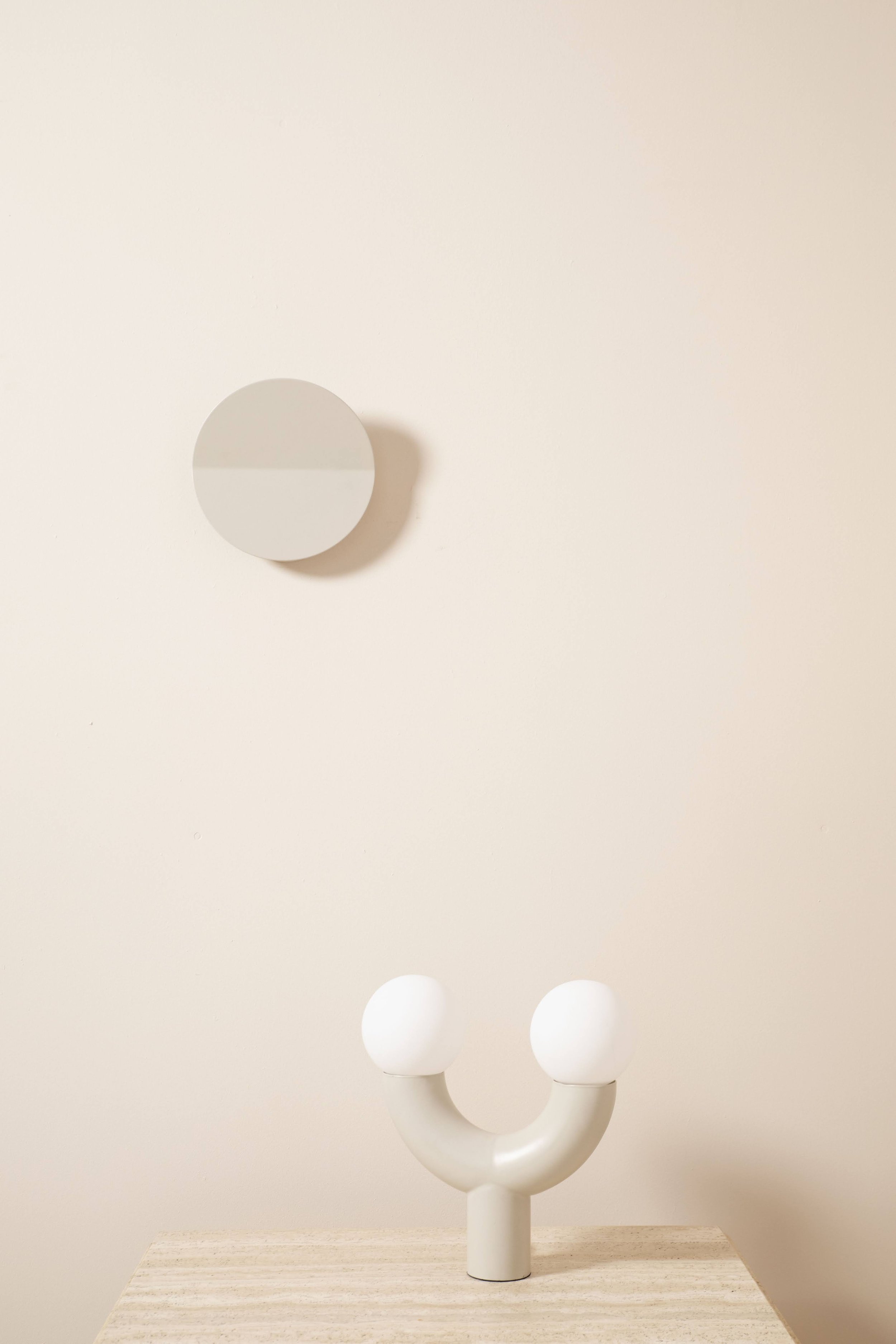
Lastly, if you could pair one of your paints with one of our lights - which would it be?
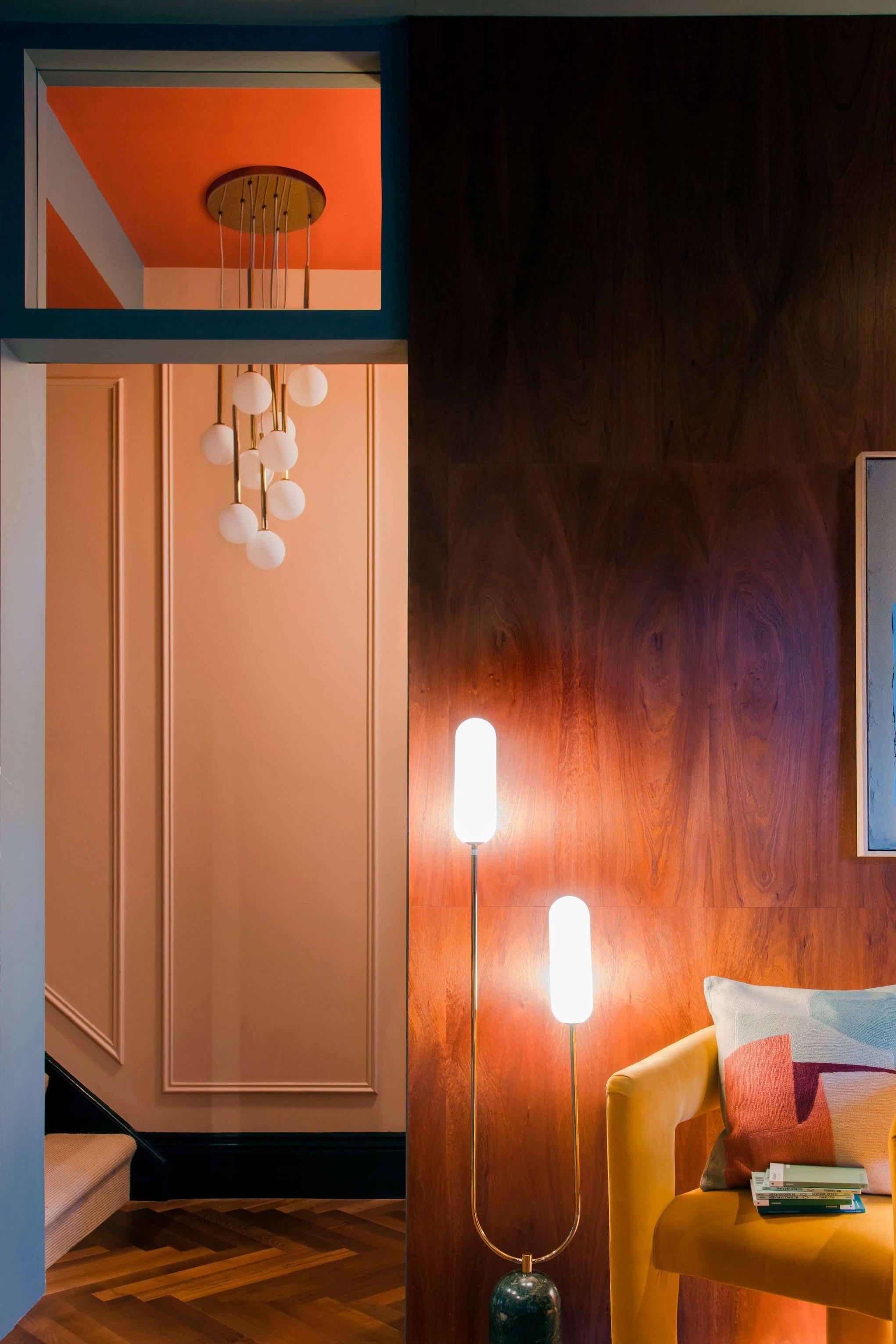
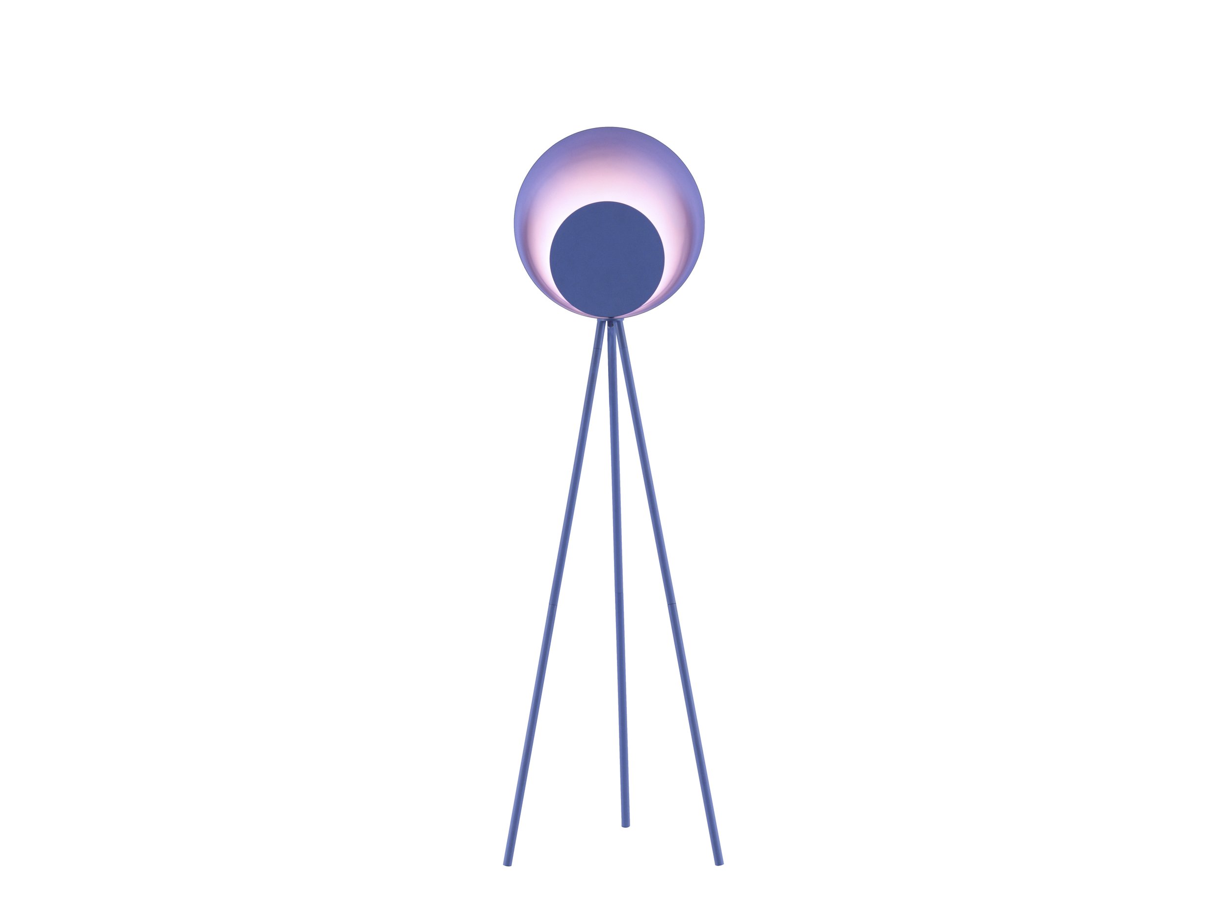
There are so many designs of yours we love. I love the Lilac diffuser wall light which would pair so well with our Fresh Peach or Serene Peach. And still obsessing over the diffuser range…the floor lamp is gorgeous too. We recently used the pink one for our brand video shoot and it looks amazing against our new Fresh Green and our Joyful Green. Pinks and greens are always such a great match but this floor lamp, in particular, was the icing on the cake!
“There are so many designs of yours we love. I love the Lilac diffuser wall light which would pair so well with our Fresh Peach or Serene Peach. ”